How to Create and Format Charts in Google Sheets
Most Google Sheets charts look cluttered and amateur out of the box. Here’s how to make your charts look clean along with all the problems folks run into along the way.
Jake Bennatt
I work in google sheets and stuff. Built XLkeys to make my job easier. You should try it, its free.
There’s a pretty good book written by Edward Tufte called “The Visual Display of Quantitative Information” that everyone who works with data or the storytelling of data should read. The gist of the book is that simple is always better when trying to display complex data to an audience. This rule should be followed whether you’re putting together a presentation for a TED talk, a school project, or a work presentation to your boss. Here’s some tips on how to make charts in Google Sheets look good fast and some helper notes on common problems most people run into.
Formatting Best Practices: Strip Everything That Isn’t Data
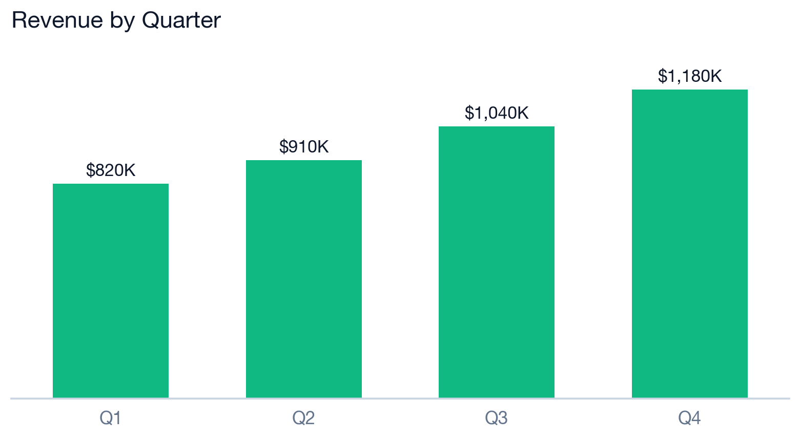
The easiest tip to implement that makes charts look better: keep only the text and design that’s required to read the chart, and delete everything else. All the gridlines, borders, and redundant labels are noise competing with your actual data. Here’s my default steps I follow for almost any chart, all of it lives in the Customize tab of the chart editor:
- Remove the background color and border. Under Customize → Chart style, set the background to None and turn off the border. That gray box and outline add nothing.
- Add data labels. Under Customize → Series → check Data labels. Now the number sits right on the bar or point and nobody has to trace a value back to the axis.
- Hide the value (Y) axis once you have data labels — it’s redundant. Google Sheets won’t let you delete the Y axis entirely, so the trick is to go to Customize → Vertical axis → Font size and set it to the minimum, then set the axis font color to white so it’s invisible against the chart. Not elegant, but it’s the best you can do.
- Keep just one baseline gridline. Select the horizontal axis and deselect all gridlines, then under the vertical axis keep major gridlines on but set the major step count to 1. That leaves a single line at the bottom for bars to sit on, without the full grid behind them.
- Remove the axis titles. If your chart title and labels are clear, an axis titled “Month” or “$” is clutter. Delete them under Customize → Chart & axis titles.
- Drop the legend if there’s only one series. If you have multiple series, move it to the top and keep it small rather than letting it eat space on the right.
Fixing the “Data Must Be in One Row” Error
This is the error that makes people give up halfway through. You go to add something to a chart and Sheets refuses with “Data must be in one row” (or “one column”). The cause is always the same: you pointed a field at a rectangle of cells that spans both multiple rows and multiple columns, when that field only accepts one row or one column. Certain inputs in the chart editor — the X-axis, an individual series, the series name, and especially custom data labels (the three-dot “Add labels” option on a series) — are each one-dimensional by definition. Hand any of them a 2D block and you get the error.
Here’s how to fix it:
- Point that one field at a single row or column. If you’re setting data labels, a series, or the X-axis, select just that one column (or one row) of values — not the whole table.
- Add each series separately. If you tried to grab several columns at once as a single series, add them one at a time so each series is its own column.
- Toggle “Switch rows / columns” under the Setup tab. If Sheets read the orientation backwards (treating your rows as series when they’re really columns), this flips it and often clears the error instantly.
- Restructure into a clean table: one header row, one column per series, no merged cells, no blank rows splitting the range, and no hidden columns in the middle.
- Make sure the values are actually numbers. A column stored as text (a stray apostrophe, a leading space, left-aligned values) reads as the wrong type — re-type a value to test, or multiply the column by 1 with Paste Special to force it numeric.
Nine times out of ten it’s the first one — you selected a whole block where Sheets only wanted a single column.
How to Build a Combo Chart
A combo chart is just a chart that mixes types — most commonly columns and a line on the same chart. Think revenue as bars with a growth-rate line on top, or MRR as columns with a target line. This is the workhorse chart in finance and it’s easy once you know where the setting is.
- Select your data and go to Insert → Chart.
- In the chart editor, under Setup → Chart type, choose Combo chart.
- Scroll down to the Series section (still under Setup). Each series gets its own dropdown where you can set it to Columns or Line.
- Set your main metric to Columns and your secondary metric (the growth rate, the target, the margin) to Line.
That’s the basic version. The moment your two metrics are on different scales — say dollars of revenue and a percentage growth rate — you’ll want to put the line on a secondary axis so it doesn’t get flattened against the bottom of the chart. That’s the next section.
The Hard One: A Stacked Bar Chart With a Line
There’s no “stacked column + line” option in the chart type dropdown, so people assume it’s impossible. It’s not — you build it from a combo chart by combining stacking with a secondary axis. A classic example: stacked MRR components (New, Expansion, Churn) as the bars, with Net New MRR or a target as a line on top.
Structure your data so it builds cleanly: first column is your category (e.g., Month), the next columns are the pieces you want to stack, and the last column is the single metric you want as the line:
| Month | New | Expansion | Churn | Net New |
|---|---|---|---|---|
| Jan | $40,000 | $12,000 | -$8,000 | $44,000 |
| Feb | $45,000 | $15,000 | -$10,000 | $50,000 |
| Mar | $50,000 | $18,000 | -$9,000 | $59,000 |
- Select the whole table and Insert → Chart, then set Chart type to Combo chart.
- Under Setup, set Stacking to Standard (or 100% if you want shares instead of absolute values).
- In the Series section, set each stacked component (New, Expansion, Churn) to type Columns and assign them to the Left axis. Because stacking is on, they’ll stack into a single bar.
- Set the line metric (Net New) to type Line. If it’s on a comparable scale to the stacked totals, leave it on the Left axis so it reads against the same numbers. If it’s on a different scale (a percentage, or a much smaller/larger number), assign it to the Right axis so it has room to breathe and isn’t crushed flat against the baseline.
Format Numbers
Google Sheets natively formats your chart data the same way it’s formatted in the spreadsheet — change the format in your sheet and the chart auto-adapts. To change formatting in Sheets fast, use the XLKeys Ctrl+Shift+1 shortcut to cycle through standardized number formats quickly.
How to Build a Waterfall Chart (Step by Step)
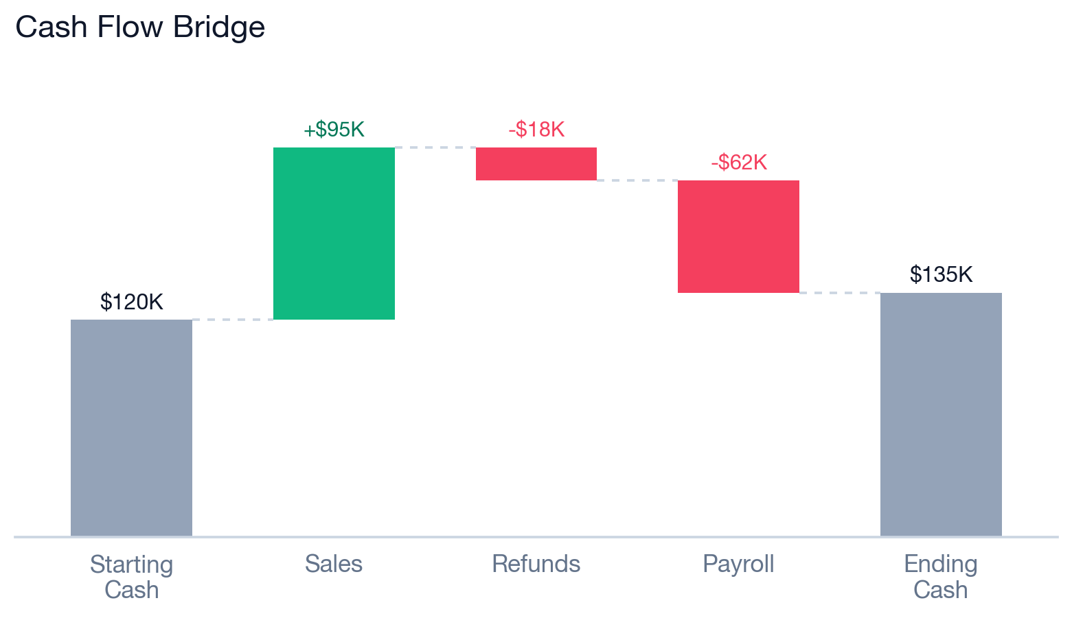
Waterfall charts are the best way to show how you got from one number to another — starting cash to ending cash, prior-year revenue to current-year revenue, the bridge between two ARR numbers. This is actually a point in Sheets’ favor: Excel still has no native waterfall chart type, while Sheets has it built in. They take a minute to set up the first time, mostly because of how you tell Sheets which bars are totals. Here’s the full walkthrough.
- Set up your data as two columns: labels in one (Starting Cash, Sales, Refunds, Payroll, Ending Cash), values in the other. Increases are positive numbers, decreases are negative numbers.
- Select the range and go to Insert → Chart.
- In the chart editor under Setup → Chart type, scroll down to the “Other” section and pick Waterfall chart.
- Anchor your starting bar. Go to Customize → Series, scroll to the bottom, and check “Use first value as subtotal.” Your first bar drops to the baseline instead of floating — that’s what you want for a starting total.
- Add subtotals in the middle (optional). Still in the Series section, click “Add new subtotal,” give it a label (e.g., “Q1 Total”), set the type to After, and choose the column where it should appear. Sheets calculates the cumulative number for you — you don’t need to add it to your data or write a formula.
Then format it like any other chart, with a couple of waterfall-specific touches:
- Color the bars by meaning: advancing (positive) bars one color, declining (negative) bars red, and subtotals/totals a neutral gray or blue so they read as anchors rather than changes. Set these under Customize → Series → the Positive / Negative / Subtotal sections.
- Add data labels so each step shows its value.
- Keep connector lines on — they’re the dotted lines that link the top of one bar to the next, and they’re what makes a waterfall readable.
- Apply the same cleanup from the top of this post: no background, no border, single baseline gridline, drop the legend if the labels are clear.
Related Google Sheets shortcuts
Make Google Sheets feel like Excel
Install XLKeys to use Excel-style shortcuts, Alt-key sequences, formula auditing, Goal Seek, Sensitivity Tables, and Workbook Health audits in Google Sheets.
Add XLKeys to Chrome